Style
How to choose your wedding photography color scheme
Choosing the right color palette shapes every photo, from the mandap to the final album. Follow our real‑world guide to create a cohesive look for your Delhi NCR wedding.
Published 29 August 2026
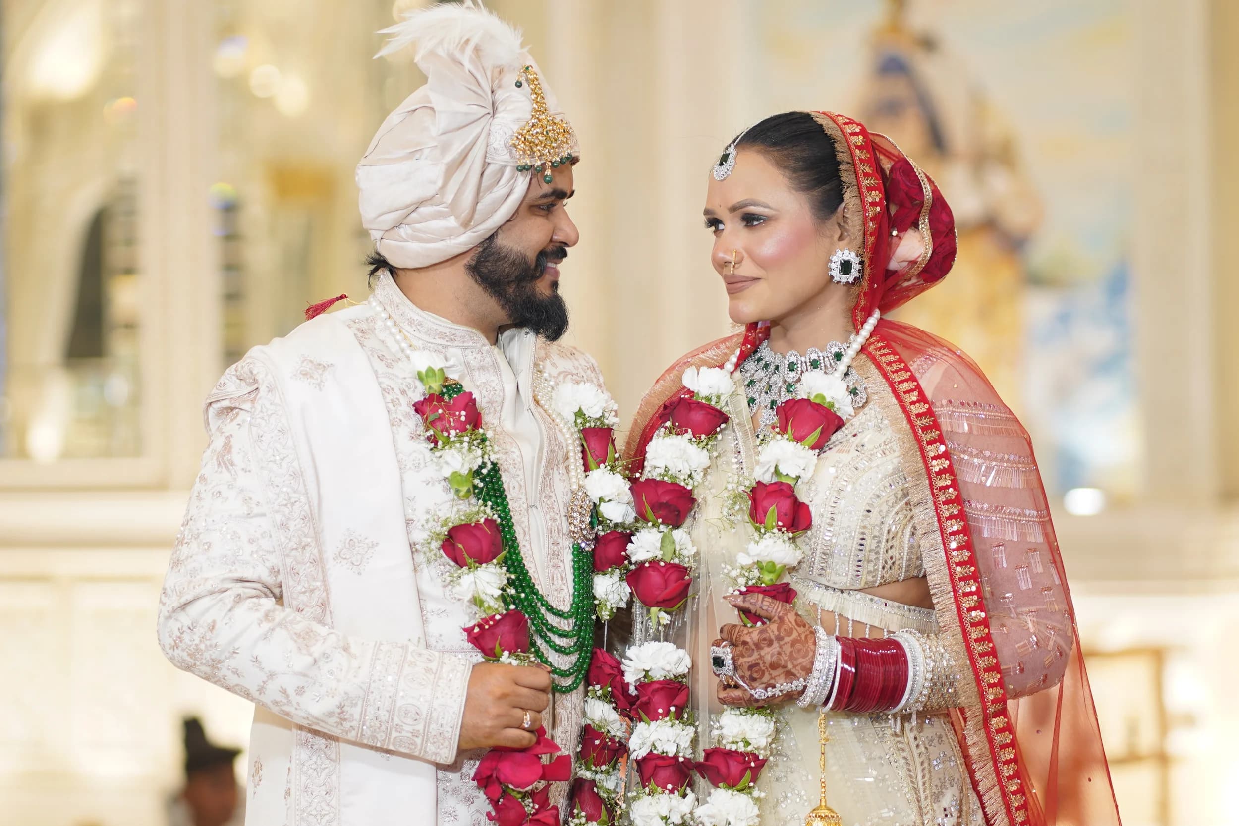
How to choose your wedding photography color scheme
During a recent ceremony at a heritage hotel in Noida, the couple opted for teal and copper, and the contrast made the marble columns pop on camera. The teal draped across the reception tables reflected the evening sky, while copper lanterns added a warm glow that our lenses captured without heavy post‑processing. If you pick colors that clash with the venue’s inherent shade, you’ll spend extra time correcting color balance later. Take a moment to walk the site with your color samples; notice how the shades change from morning to dusk. That simple walk often saves you from a mismatch that would otherwise be obvious in the final album.
Match the palette to venue and lighting
Outdoor weddings in the gardens of Gurgaon often deal with shifting sunlight, so a palette that tolerates both bright noon and golden hour works best. Earthy greens, terracotta, and soft blush survive the harsh midday sun without blowing out, while still glowing as the sun dips. Conversely, an indoor reception with dimmed LEDs benefits from a splash of saturated jewel tones that punch through the lower light levels. Remember that the photographer’s white balance settings will adapt, but the raw colors you feed them are what determine the final mood. Choosing colors that complement the venue’s existing palette reduces the need for heavy color correction later.
Consider your cultural hues and traditions
That’s why how to choose your wedding photography color scheme should start with a list of mandatory hues dictated by family customs. From there, you can layer complementary shades that reflect your personality, like a teal accent if you love the sea, or a dusty rose if you favor vintage romance. I recommend laying out fabric swatches side by side with your invitation card to see which tones echo the same ink or paper texture. When the swatches harmonize, the photographer can plan lighting setups that highlight those colors without oversaturation. A cohesive color story makes the album read like a visual poem rather than a disjointed collection.
Test the colors with a pre‑wedding shoot
After the shoot we run a quick edit in Lightroom, pulling the same profiles we’ll use on the wedding day. When the edited previews still show the desired contrast and saturation, you know the palette will survive the post‑processing stage. If the edited version looks washed, consider deeper shades or add a pop of metallic to keep the vibrancy. Because the camera sensor captures a broader range than the eye, what looks good on the monitor often translates to richer prints. A successful test means fewer surprises on the actual day and a smoother workflow for the whole team.
Final checklist for a cohesive look
Before you sign the final vendor contract, run through this quick checklist: confirm venue lighting, lock in mandatory cultural colors, test the palette in a pre‑shoot, and share the swatches with your florist and décor designer. Ask your photographer—whether it’s SRG PRODUCTION or any seasoned professional—to review the colors on a calibrated monitor, ensuring they render accurately. Mark the key moments where you want the color to shine, such as the first look, the cake cutting, and the exit, and plan lighting accordingly. Finally, trust your instincts; the colors that make you smile during the planning meetings will also make you glow on the day. When every element sings the same hue, the album becomes a timeless story that you’ll revisit for decades.